In this section, we provide recommendations to guide your inclusion of accessible, image-based content.
What Are Images?
Images include: photographs, diagrams, pictures, charts, graphs, maps
File types: .gif, .jpg, .png
Before You Begin
Why Are You Including the Images You Have Selected?
Before you can determine what you need to do to make an image accessible, you first need to identify its purpose or value to your textbook. Consider the following questions:
1. Does your image serve a functional purpose? In other words, is it conveying non-text content to students? If so, you should:
- Provide a text alternative that serves the equivalent purpose of the non-text material[1]
- Not use colour as the only visual means of conveying information[2]
2. Does your image serve more of a decorative purpose? In other words, is it primarily a design element that does not convey content? If so, you should:
- Avoid unnecessary text descriptions
What Do You Need To Do?
Functional Images and Alternative Text Descriptions
Consider what your content page would look like if the images didn’t load. Now try writing alternative text for each image that would work as a replacement and provide the same service as the image.
As you work on developing your alternative text descriptions, keep the following recommendations and guidelines in mind:
- Remember that alternative text must convey the content and functionality of an image and is rarely a literal description of the image (e.g., “photo of cat”). Rather than providing what the image looks like, alternative text should convey what the content of the image is and what it does.[3]
- For relatively simple images (e.g., photographs, illustrations), try to keep your text descriptions short. You should aim to create a brief alternative (one or two short sentences) that is an accurate and concise equivalent to the information in the image.
- For more complex images (e.g., detailed charts, graphs, maps), you will need to provide more than a one- to two-sentence description to ensure all users will benefit from the content or context you intended to provide. In these cases, you should either provide the details in the text surrounding the image or write a longer text description that students can link to on a separate page. You should still include a short text description (one to two sentences) that tells students where they can find the details you have provided in the longer description.
- Leave out any unnecessary information. For example, you do not need to include information like “image of…” or “photo of…”; assistive technologies will automatically identify the material as an image, so including that detail in your alternative description is superfluous.
- Avoid redundancy of content in your alternative description. Don’t repeat the same information that already appears in text adjacent to the image.
Here are two examples of alternative text descriptions.
Example 1 (from Introduction to Sociology):
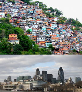
This photograph could be described in this way:
Figure 20.11 includes two photos. The first photo shows crowded buildings located on the hillside. They are small and shabby. The second photo shows magnificent buildings located by water.
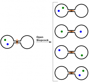
Example 2 (Figure 18.1. Two-Atom, Double-Flask Diagram from Introductory Chemistry):
When the stopcock is opened between the flasks, the two atoms can distribute in four possible ways.
Figure 18.1 could be described as follows:
Figure 18.1 shows a diagram with five pairs of circles. All of these circles are open. The left one opens on the right and the right one opens on the left. They are connected with lines at their open points. One pair is located on the left and between their two connecting lines is a black dot with a red vertical line going across. The other four pairs arranged in a column are located on the right and between the connecting lines of each pair is a a small circle with a red horizontal line going through. A right arrow labelled Open Stopcock links the pair sitting on the left to the four pairs on the right. Each of these five pairs has two dots (green and blue) arranged in different patterns. For the pair on the left, the two dots, sitting obliquely, appear only in left circle. The green dot is at the left upper part of the circle and following it the blue dot is close to the bottom right. The first pair on the right has the similar situation. The only difference is that the green dot is at the right upper part of the circle and the blue dot is close the middle left. The second pair has a green dot in the centre of the left circle and a blue dot in the centre of the right circle. The third pair has a blue dot sitting at the left upper part of the left circle and a green dot sitting close to bottom right of the right circle. For the last pair, the two dots appear in oblique direction only in the right circle. A green dot is at the right upper part of the circle and a blue dot is close to bottom left.
Using Colour
Consider what your images would look like if they only displayed in black and white. Would any necessary context or content be lost if the colour was “turned off”? Images should not rely on colour to convey information; if the point you are making depends on colour to be understood, you may need to edit your image or formatting so that concepts presented are not lost to those who are colour blind or who require high contrast between colours.
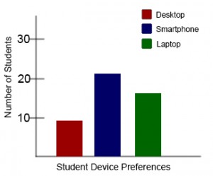
Example 1 — not accessible:
In this basic bar chart, colour is the only means by which information is conveyed.
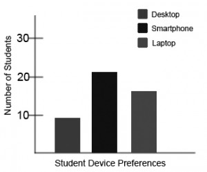
Example 2 — not accessible:
For a student who is colour blind or who has poor contrast vision, all of the relevant information is lost in a colour chart.
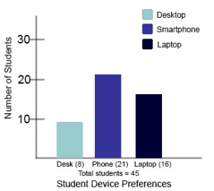
Example 3 — accessible:
Students who are colour blind can distinguish between high-contrast shades. In this example, contextual labels have been added to each bar at the bottom of the chart. Note that the chart will still require an alternative text description.
Decorative Images
If your image does not add meaning and is included for decorative or design purposes only, the space for the alternative text description should still be included with your image, but it should be left empty or blank. Assistive technologies will detect the image, and by leaving the alternative text description blank, you will signal to the student that there isn’t any contextual content embedded. Including alternative text descriptions for decorative images “simply slows the process down with no benefit because the screen-reading software vocalizes the content of the [alternative text description], whether that alternative text adds value or not.”[4]
- Web Content Accessibility Guidelines (WCAG) 2.0, Guideline 1.1 Text Alternatives. Accessed from: http://www.w3.org/TR/WCAG20/#text-equiv ↵
- Web Content Accessibility Guidelines (WCAG) 2.0, Guideline 1.4.1 Use of Color. Accessed from: http://www.w3.org/TR/WCAG20/#visual-audio-contrast ↵
- WebAIM (2014). Alt text blunders. Accessed from: http://webaim.org/articles/gonewild/#alttext ↵
- webAccess (2012). Adapted from: Top Ten Tips for making your website accessible. Accessed from: http://webaccess.berkeley.edu/developer-information/top-ten-tips/#alt ↵
